First: Here is a little tip that I discovered while doing my nails (don’t ask!).
 This little bottle of “Base Coat” Nail Polish is absolutely fantastic for making your black lines “POP” from your colored images!!! - comes with it’s own little brush!! - from the $$$ store. AND it also adds a slight gloss and stiffens your cut image!! WOW – all that from an

OK, on with my tutorial…….. I started with this little image of Snoesjes - Snoes with Bird, from Marianne Designs – available at OCS. This little fella really grew on me………. I stamped the image onto XPress It Blend Cardstock, with Memento Tuxedo Black , colored it with Copic Markers and fussy cut him out. (Sometimes a light bulb goes on, sometimes a candle flickers) Here’s what I did to bring my card to fruition.
Next I chose some masculine papers and elements – for April’s OCS’s Masculine Challenge. The DP paper is from an Authentique Paper Collection


I sponged Tim Holtz Distress Ink, “Tea Dye” to all the papers to give a Vintage look.

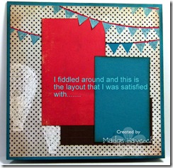
Then I began to place color blocks until I was satisfied with the result.
The red color block was positioned under the cut-out. I also penciled in “H-A-P-P-Y B-I-R-T-H-D-A-Y” onto the banner.


3 Dimensional foam squares were placed on back side of image.
I added the elements, (stars, feather and twine) to the card and placed the image over the twine – placing the sentiment in between the twine to give a matted look.

Above, is the finished result ~ Colorful, masculine and regular postage rate thickness for mailing. I also added papers to the inside of the card – for more “eye candy”.
Til Next Time. “Stamp up a storm, ink up a wish – and send it on to brighten someone’s day”.
~ rubber hugz ~


